Case Study 1: OMF Help Center
🧩 Challenge
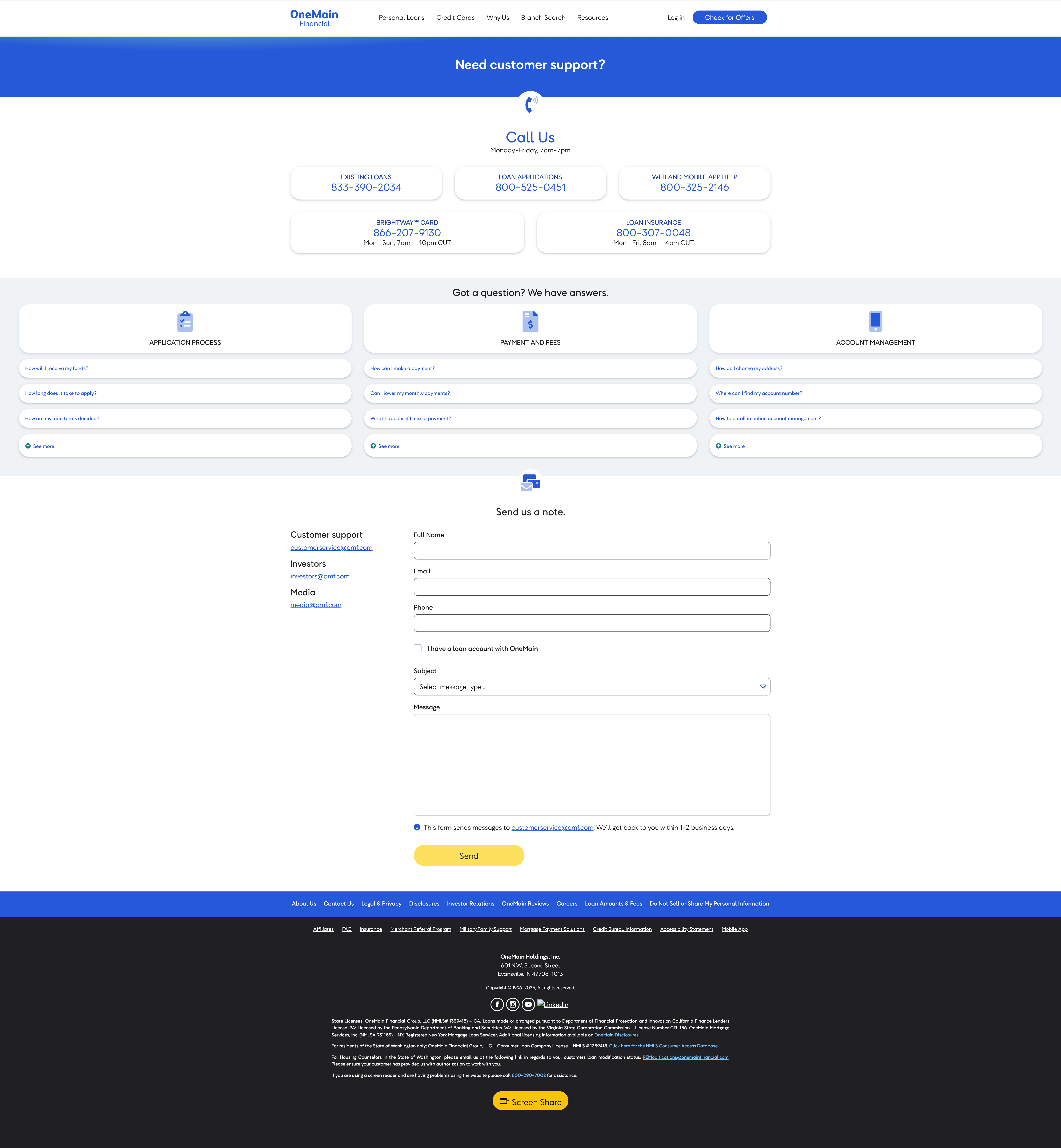
OneMain Financial lacked a centralized Help Center, forcing users to call customer support for basic questions. This created frustration for customers and unnecessary operational costs. The existing support content was scattered across disconnected channels, with no cohesive strategy or accessibility standards.
🗺️ Approach
I led the UX strategy and design of a new Help Center MVP, with the plan to stretch this into four major iterative releases.
This included:
Conducting user research to identify top customer pain points.
Partnering with the content team to structure information clearly.
Designing the experience in Figma, ensuring accessibility guidelines (WCAG 2.2 AA) were met.
Collaborating with engineering to ensure smooth integration with the existing web ecosystem.
UXR
I partnered with our research SME to ground the Help Center MVP in user insights rather than assumptions. We conducted a card sorting exercise to establish a clear taxonomy for support topics, ensuring that information was categorized in ways that matched customer expectations. We also leveraged existing research from the Contact Us page as foundational discovery, which provided a starting point for understanding how users currently sought help.
From a business perspective, our MVP had a clearly defined, measurable goal, which was established through analysis of support ticket data and projected cost savings from reduced call center volume.:
Reduce customer support call volume by 10%

This gave the UX strategy a laser focus on self-service, getting customers the answers they needed without pushing them to immediately call or email. To accomplish this, we pushed traditional contact channels further along in the flow, encouraging users to first try FAQs and help content.
Importantly, the existing Contact page only addressed the loan product experience, leaving gaps for customers of other OMF products like Brightway, Trim, or Insurance. The Help Center MVP expanded access to these areas by linking to external support resources, with a clear roadmap to fully integrate all product lines into one unified Help Center in future iterations.
Content Team Partnering
I worked closely with a fellow UX'er and a copywriter from the creative team to craft new FAQ content that was clear, actionable, and written in a tone that aligned with our brand. We iterated multiple times on content drafts, balancing compliance requirements with a user-friendly tone. Each FAQ was tested for clarity, ensuring users would leave with definitive answers rather than ambiguous instructions.
This collaboration not only improved the quality of the written content but also set a repeatable content creation framework for future Help Center expansions.
Design Iterations
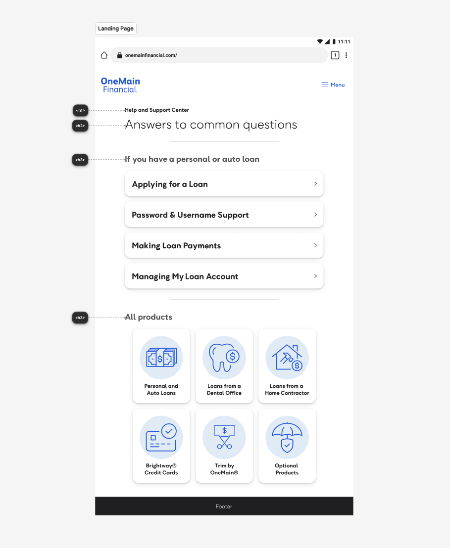
With taxonomy and content in place, we moved into design. The strategy for the MVP was guided by minimalism and simplicity, with the mindset to try to remove first, then add, focusing on only what was necessary to get customers answers quickly. Competitive research pointed toward truncated card layouts with clear categorization as a best practice, and we adopted that approach while ensuring alignment with OMF's brand style guides.
A major UX enhancement was prioritizing the most common questions directly on the landing page. By analyzing quantitative data from analytics tracking, along with call and email logs, I surfaced the top FAQs and structured them intelligently using the categories from our card sorting exercise. This reduced clicks and cognitive load, helping customers resolve issues more quickly.
Before handoff, I conducted a full accessibility audit in Figma, adjusting color contrast, font scale, and interactive elements to ensure compliance with WCAG 2.1 AA standards. Accessibility wasn't treated as an afterthought, it was embedded into the design system from the prototype stage.
Engineering Collaboration
Once the designs were flagged as “Ready for Dev,” I continued to stay actively engaged with engineering throughout implementation. I monitored releases in the testing environment to ensure design parity with Figma, but more importantly, to validate that the UX flow translated smoothly in a real browser environment. Prototypes can look flawless in Figma but behave differently once coded, so this stage was critical for catching edge cases.
I also used this phase to evaluate microinteractions, small but meaningful details in hover states, animations, or transitions that add polish and usability. By collaborating closely with engineering, I was able to make iterative refinements, ensuring the final product wasn't just aligned to the design specs, but also felt intuitive and responsive for real users.
💡 Solution
The Help Center provided intuitive self-service pathways, optimized for SEO and accessibility. We designed it around modular, searchable content components and included responsive layouts for mobile-first use. I implemented a feedback loop mechanism so users could rate the helpfulness of articles, giving the team actionable insights.
🎯 Impact & Results
15%
Reduction in call volume for common support questions, exceeding the 10% target
Improved
Customer satisfaction through faster self-service solutions and 24/7 availability
Enhanced
SEO visibility by centralizing support content and optimizing for search
Scalable
Foundation established for future enhancements including chatbots and AI-driven support